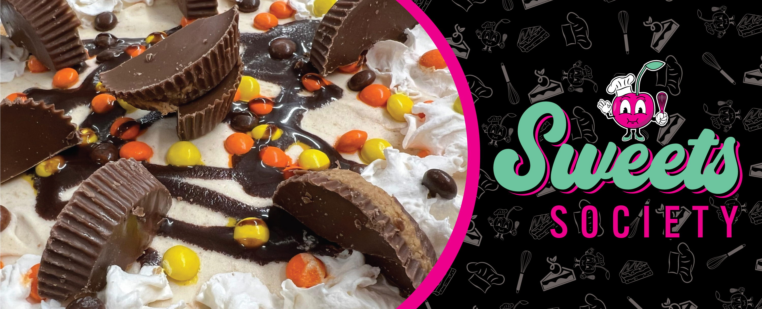
Sweets Society
Branding
Playful dessert brand built on bold identity and personality.
Playful dessert brand built on bold identity and personality.
Modern, minimal identity designed to feel clean and welcoming.

Bold, nostalgic brand inspired by environment and personality.
Ongoing high-energy social media content and motion ads.

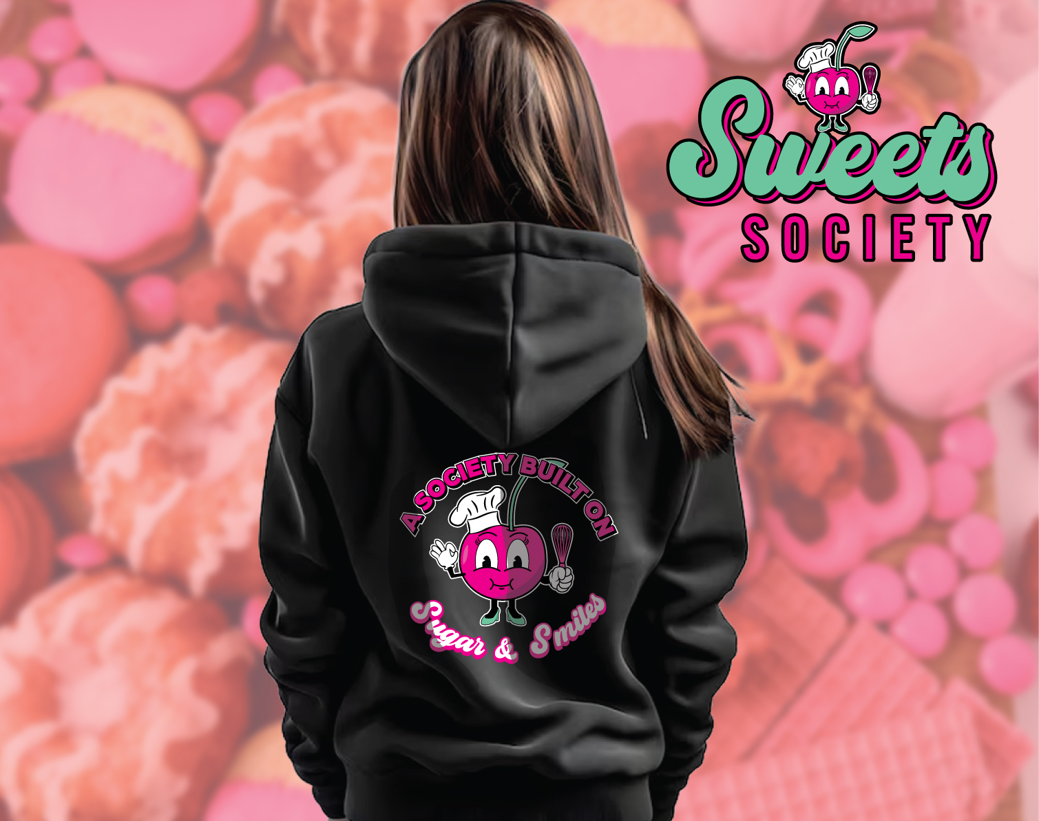
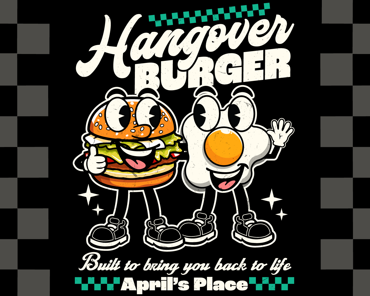
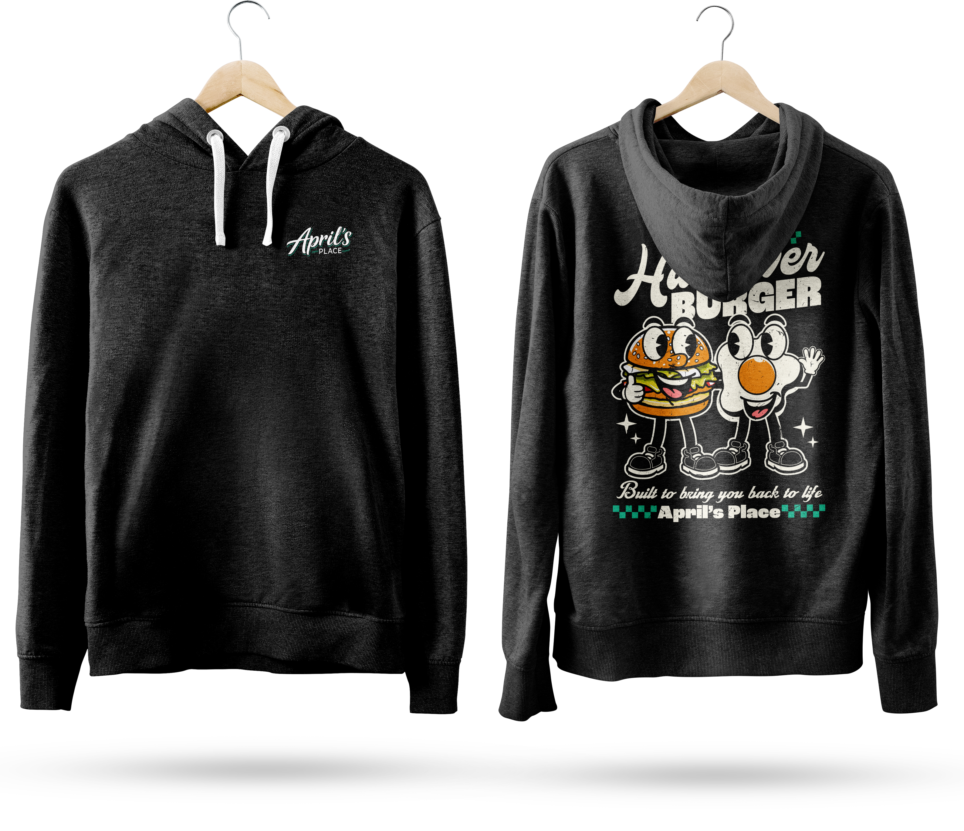
Custom apparel graphics designed to feel bold, wearable, and connected to each brand’s identity.
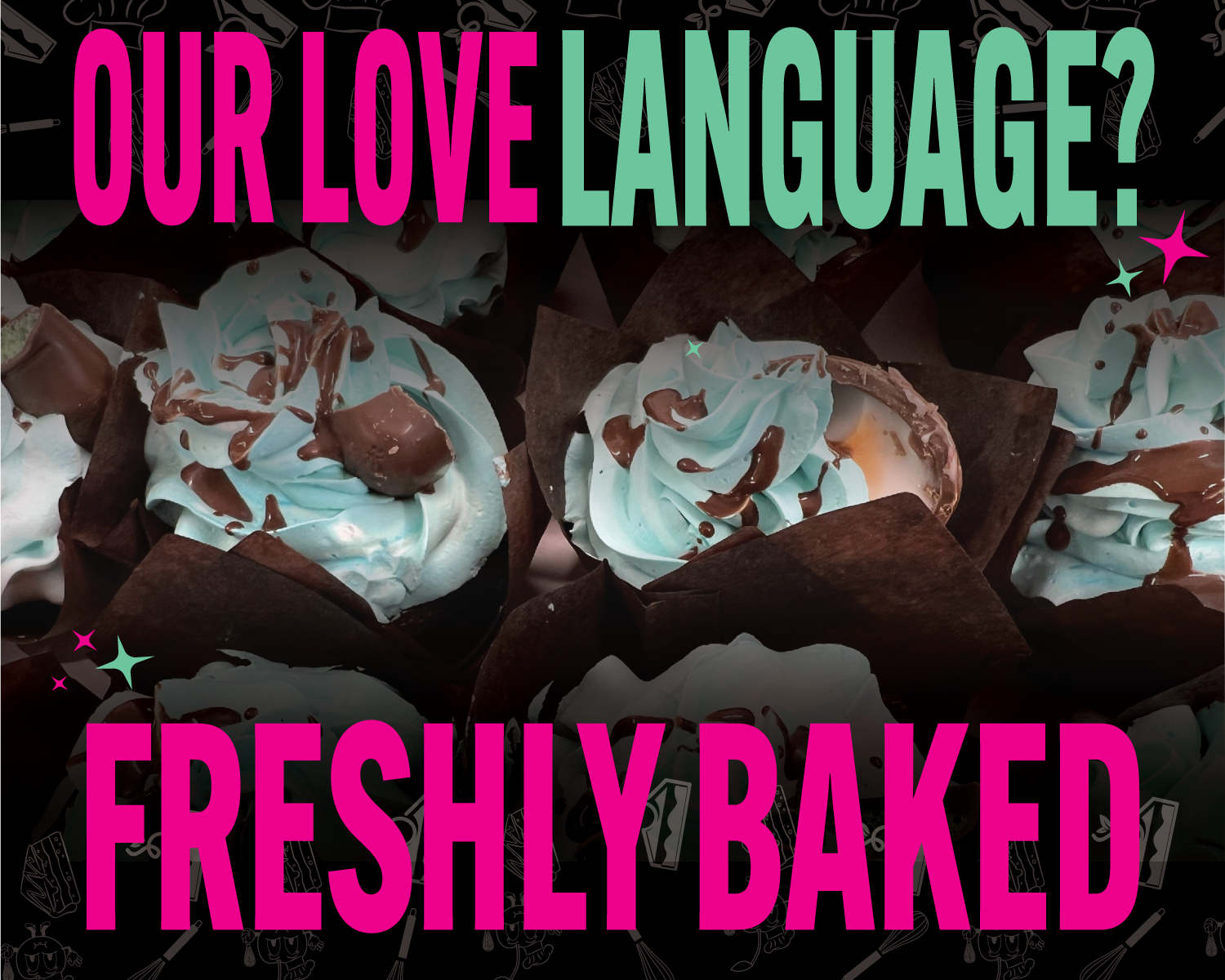
Promotional & Marketing Design built to promote events, products, and brands through bold, attention-grabbing design.
Brand Identity / Packaging / Social Media
Sweets Society was developed as a vibrant, personality-driven brand designed to stand out both digitally and in physical applications. The project focused on building a cohesive identity system that could extend across packaging, social media, and branded materials while maintaining a strong, recognizable look.
The idea behind Sweets Society was to create more than just a dessert brand — but a visual experience centered around color, community, and fun. The name itself reflects a sense of belonging, making the brand feel like a shared space built on sweetness and personality.
Client: Sweets Society
Industry: Dessert / Food Brand
Scope:
Brand Identity
Logo Design
Packaging Direction
Social Media Design
Deliverables:
Logo System
Color Palette
Packaging Mockups
Social Media Graphics
Bright magenta and mint green create a sweet but modern contrast, while black and white keep the identity flexible across packaging, social media, and branded materials.


Sweets Society was built around a vibrant magenta and mint green palette designed to feel playful, energetic, and instantly recognizable. Magenta brings boldness and personality, while mint green adds freshness and contrast to keep the identity feeling modern and visually engaging. Black and white were incorporated to ground the brand and create flexibility across packaging, social media, and promotional materials while maintaining a consistent, personality-driven look.
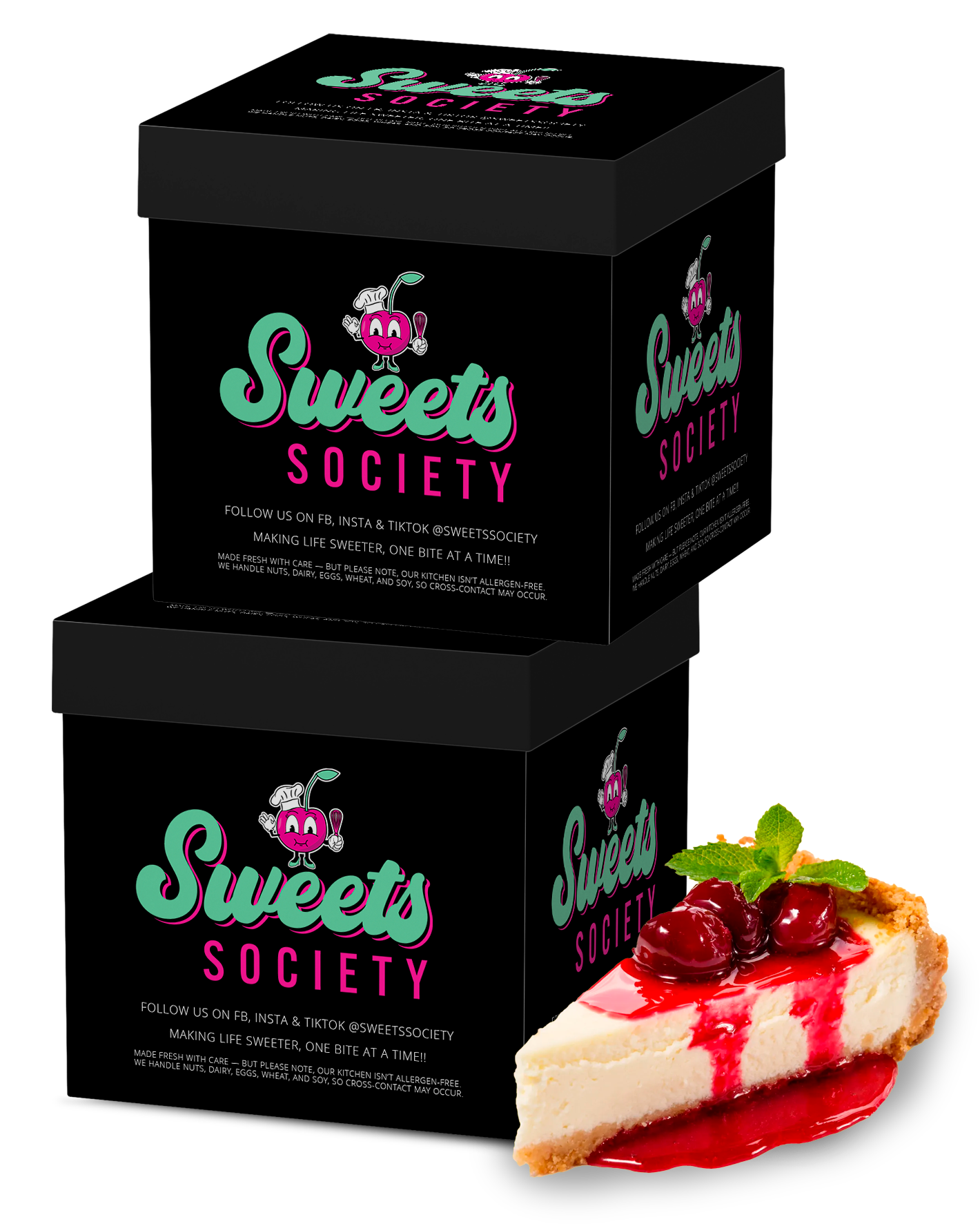
The identity was built to extend across multiple touchpoints, including social media graphics, packaging, promotional materials, and branded visuals. Each piece was designed to feel consistent, colorful, and recognizable.
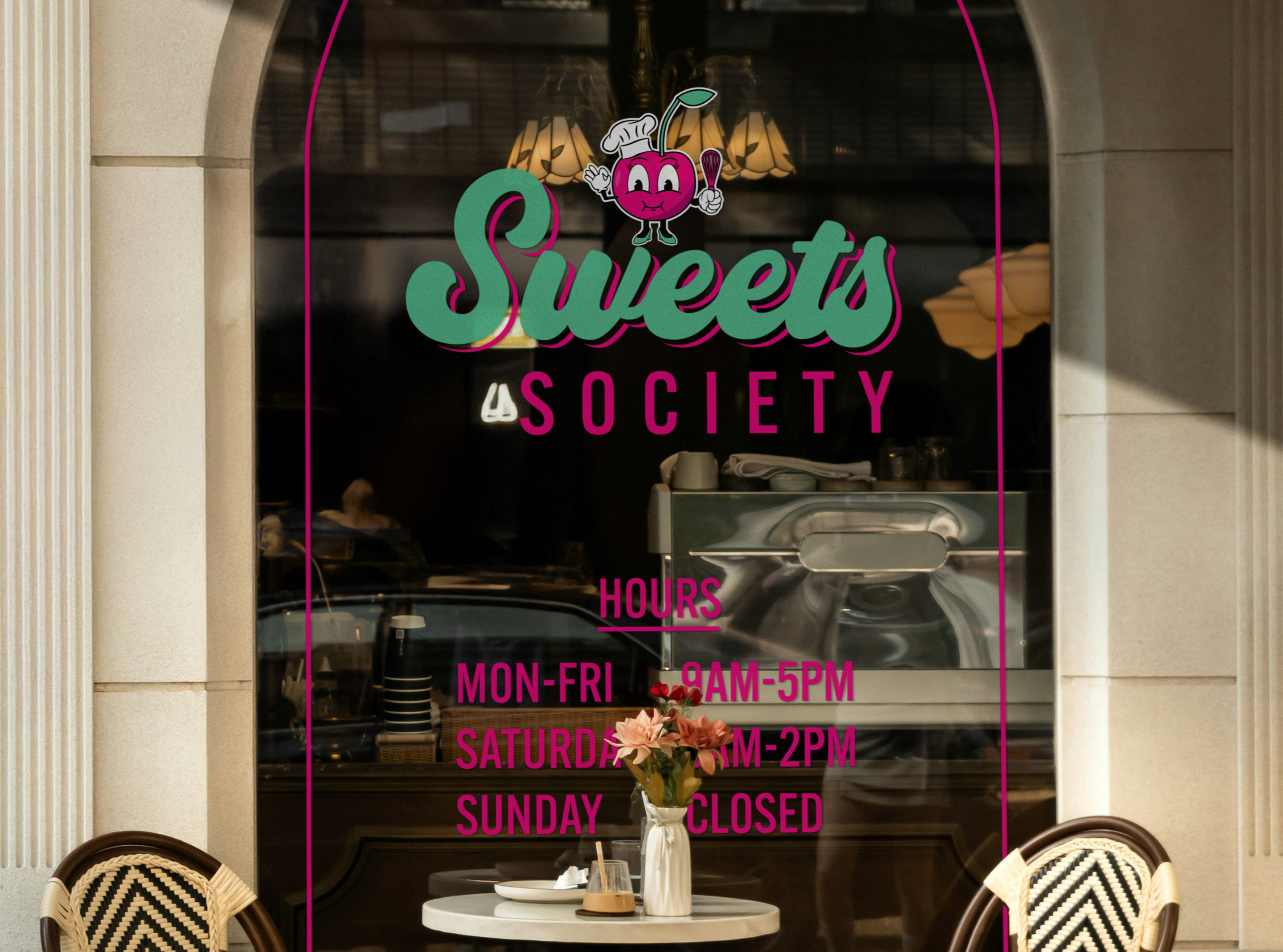

Sweets Society was built to feel fun, bold, and instantly recognizable.
Every element—from the color palette to the logo and applications—was designed to create a consistent, personality-driven brand that stands out both online and in real-world environments.
A brand built on sugar, color, and identity.

Brand Identity / Packaging / Social Media
April's Place was developed as a modern, approachable brand designed to feel inviting, recognizable, and professional. The project focused on creating a visual identity that could work across digital content, branded materials, and everyday customer touchpoints.
The idea behind April's Place was to create a brand that feels personal and memorable while still staying clean and flexible. The visual direction balances warmth, simplicity, and confidence so the brand can feel friendly without looking unfinished or overly casual.
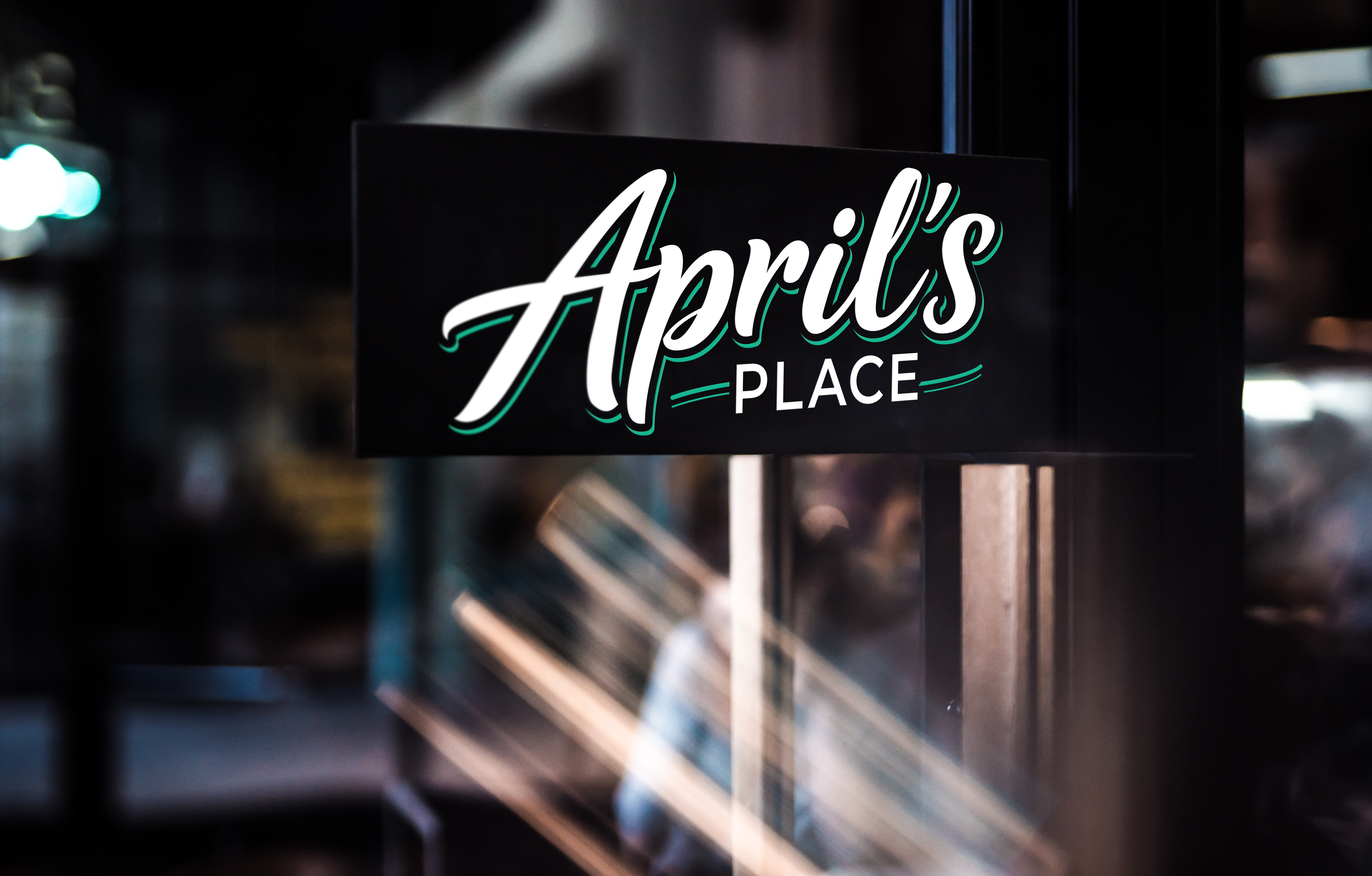
Client: April's Place
Industry: Food / Small Business Brand
Scope:
Brand Identity
Logo Design
Visual Direction
Social Media Design
Deliverables:
Logo System
Color Palette
Typography Direction
Branded Graphics
Branded Graphics
The visual direction for April's Place uses clean contrast, simple structure, and a polished color palette to create a brand that feels modern, trustworthy, and easy to recognize. Every design choice was made to keep the identity flexible across social media, print, and branded materials.


April’s Place uses a clean teal, white, and black palette designed to feel modern, welcoming, and recognizable. The teal adds personality and energy while remaining polished and approachable, while white and black create strong contrast across signage, menus, apparel, and digital applications. Together, the colors create a balance between a modern visual identity and the comfortable neighborhood atmosphere the restaurant wanted customers to experience.
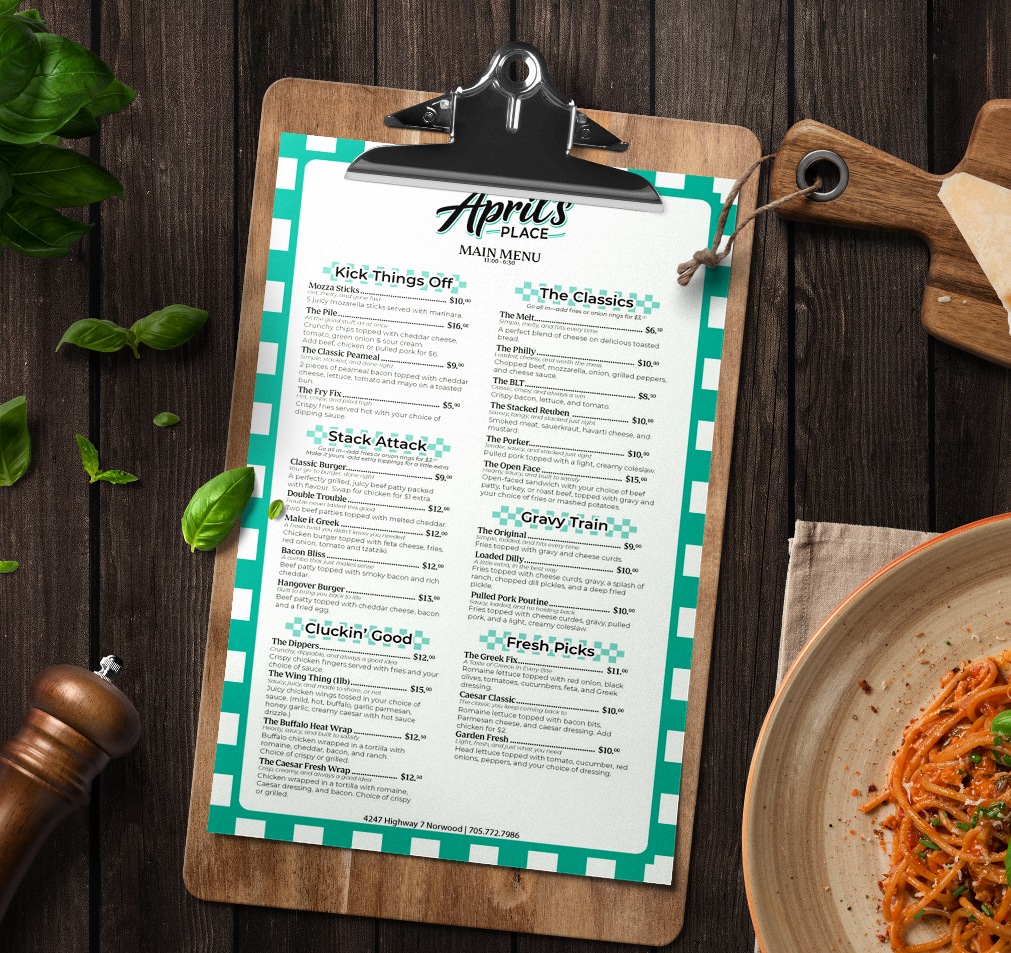

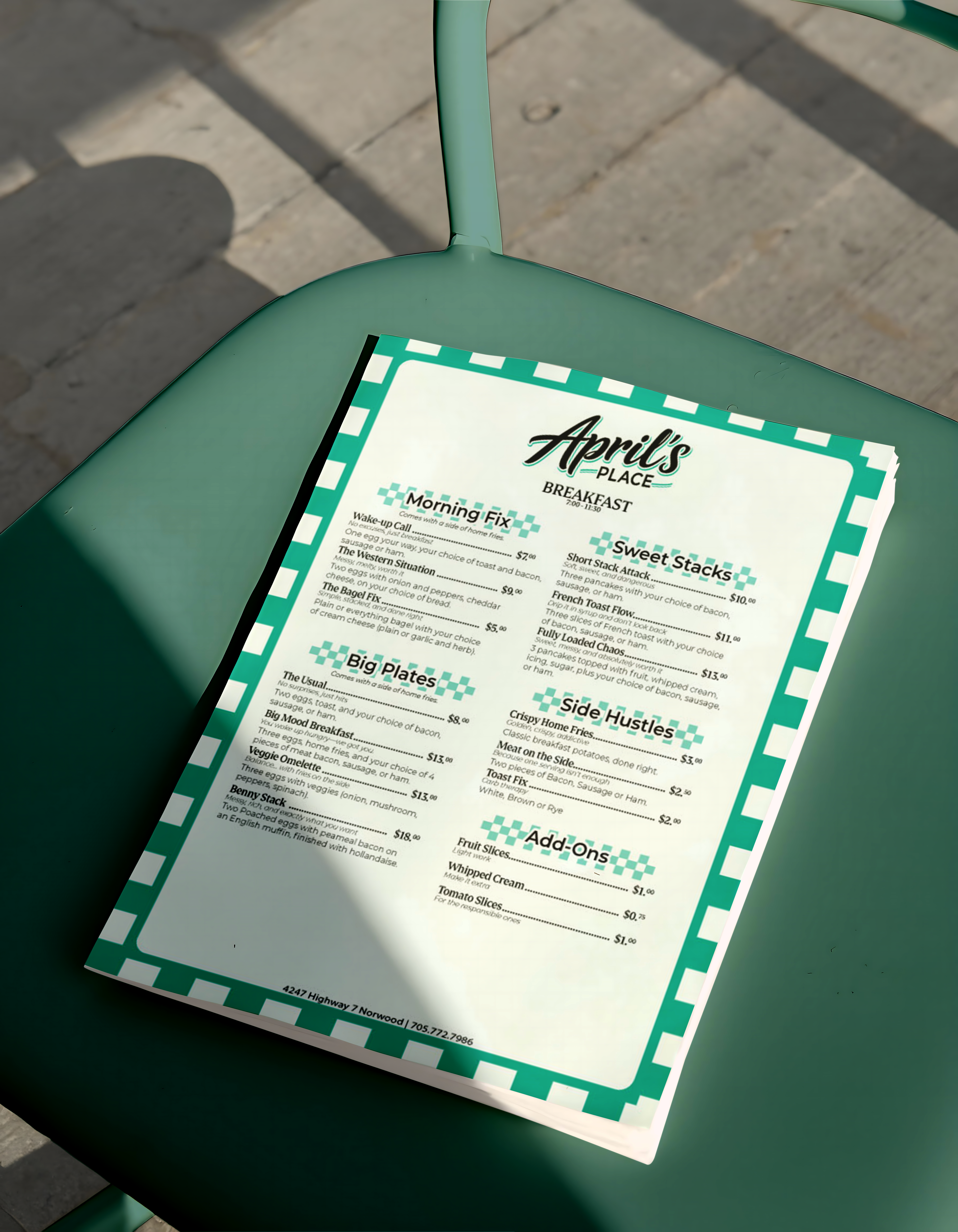
The identity was designed to extend across multiple touchpoints, including social media, signage, promotional materials, and branded graphics. Each application keeps the brand consistent while giving it room to feel personal, polished, and recognizable.
April's Place was built to feel clean, welcoming, and memorable.
From the logo system to the branded applications, every element was created to help the business show up with consistency, personality, and a stronger visual presence.
A brand made to feel personal, polished, and easy to recognize.
Brand Identity / Logo Design / Color System / Packaging
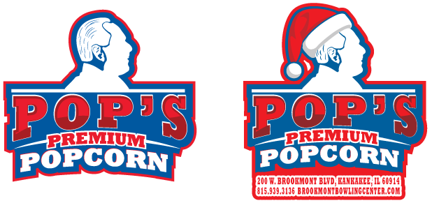
Pop's Popcorn was created for a well-known local business owner who wanted the brand to feel personal, comfortable, and easy to recognize. The identity needed to feel familiar to the community while still looking polished enough to work across packaging and branded materials.
The logo was built from the owner’s silhouette, turning his likeness into a memorable brand mark. Because he is already recognizable in town, the design connects the product directly back to the person behind it, giving the brand a sense of trust, personality, and local character.
Client: Pop's Popcorn
Industry: Food / Snack Brand
Scope:
Brand Identity
Logo Design
Color System
Packaging Direction
Deliverables:
Logo System
Color Palette
Packaging Design
Branded Graphics
The visual direction focused on creating a brand that felt friendly, familiar, and bold. The color system was designed to feel warm and approachable while giving the packaging enough contrast to stand out on shelves, counters, and promotional materials.

The color palette for Pop’s Popcorn was inspired by the nostalgic atmosphere of the bowling alley where the product is sold, while also tying into the owner’s established print business identity. The combination of deep blue, bright red, white, and rich burgundy creates a bold retro-inspired visual system that feels energetic, recognizable, and rooted in classic American concession culture. These colors were intentionally selected to capture the fun, social atmosphere of bowling while giving the brand a strong shelf presence and memorable identity. The contrast between the vibrant red and deep blue creates a sense of excitement and movement, while the white and burgundy help balance the palette with a timeless, established feel that reflects both local tradition and handcrafted quality.
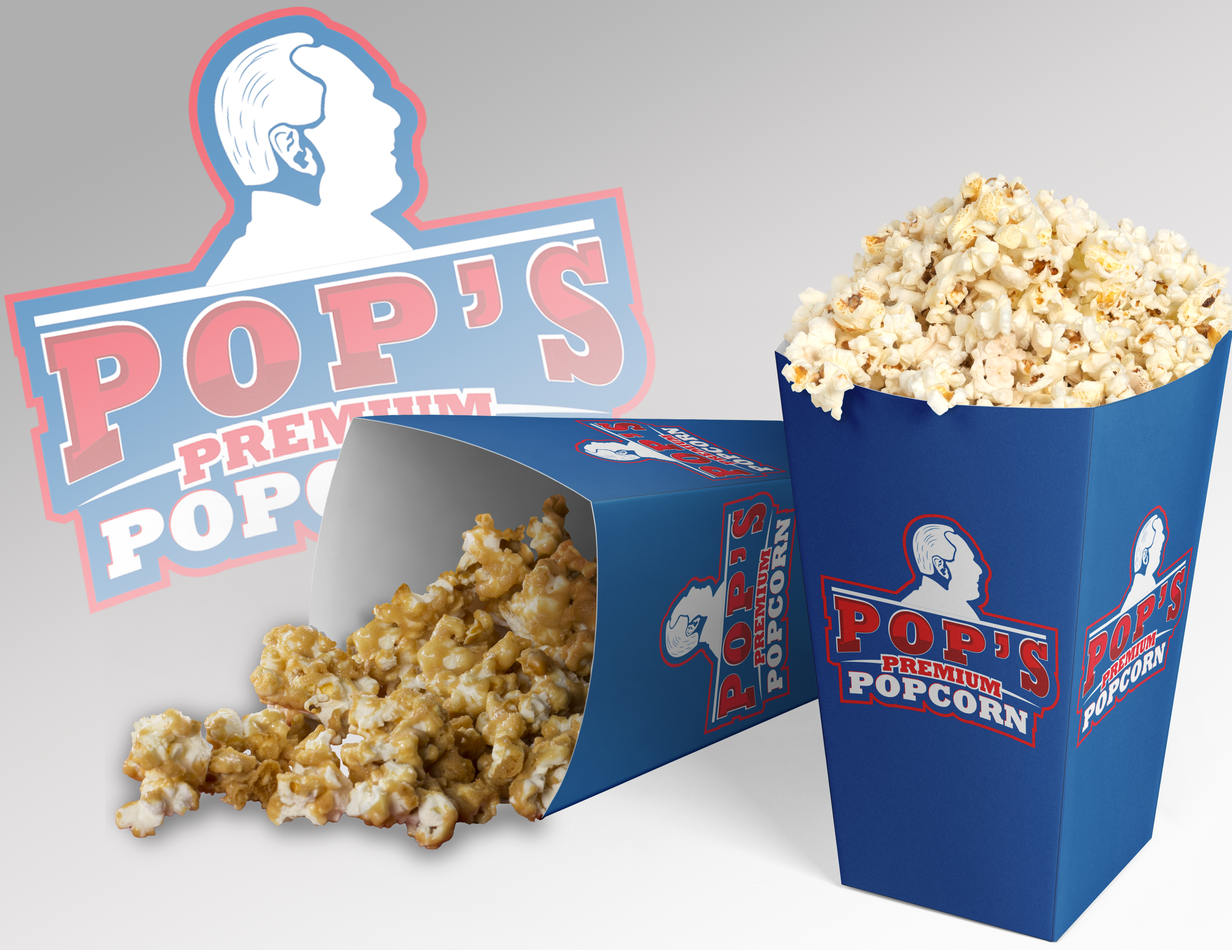


The identity was designed to work across packaging, labels, promotional graphics, and branded materials. Each piece keeps the brand recognizable while making the product feel personal, local, and easy to connect with.
Pop's Popcorn was built to feel personal, comfortable, and recognizable.
From the owner-inspired logo to the color system and packaging, every element was created to connect the product back to the person behind the brand and the community that already knows him.
A local brand with personality, familiarity, and flavor.
Social Media / Motion Ads / Promotional Content

Garage Band Brewery’s social media content focuses on promoting special events, featured beers, seasonal releases, and daily promotions through bold, engaging visuals and motion-based advertising. The goal was to create content that feels energetic, attention-grabbing, and consistent with the brewery’s gritty, music-driven identity.
Rather than building a full rebrand, the focus was placed on creating promotional content that could quickly capture attention across social media while still feeling authentic to the brewery’s atmosphere. Each design was built to highlight specific events, drinks, or promotions while maintaining a recognizable visual style.
Client: Garage Band Brewery
Industry: Brewery / Craft Beer
Scope:
Social Media Design
Motion Ads
Event Promotions
Beer Promotion Graphics
Deliverables:
Animated Social Ads
Promotional Graphics
Event Announcements
Beer Feature Content
The visual direction uses bold typography, high contrast, warm tones, and fast-paced layouts designed to feel energetic and attention-grabbing. Motion and movement play a major role in helping promotions stand out while matching the lively environment of the brewery itself.
The content was created specifically for social media promotions, helping Garage Band Brewery advertise events, beer releases, and special offerings in a way that feels bold, current, and visually engaging. Each piece was designed to quickly capture attention while maintaining consistency across the brewery’s online presence.
Garage Band Brewery’s promotional content was built to feel loud, energetic, and instantly noticeable — reflecting the atmosphere of the brewery while helping events and featured products stand out across social media.
Merch / Apparel Graphics / Promotional Clothing
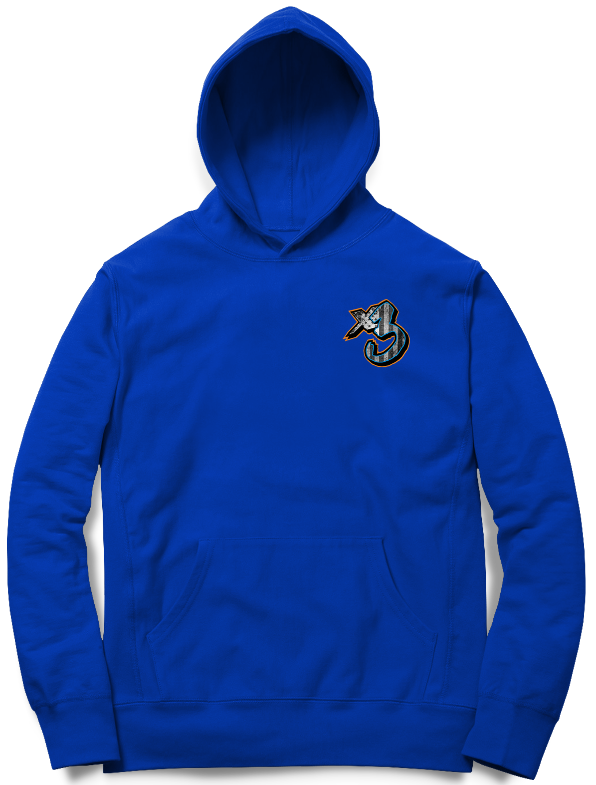

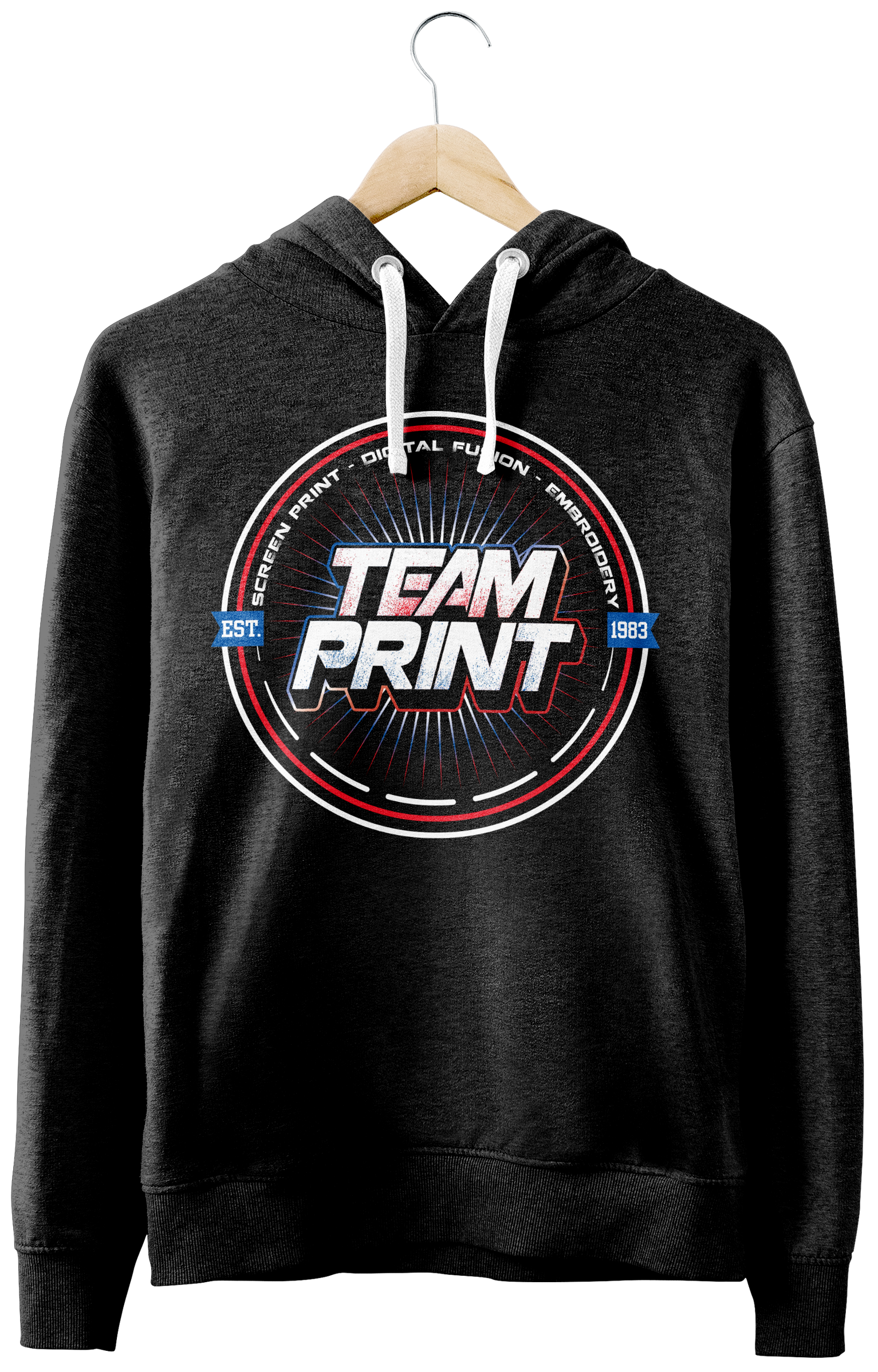
Apparel design gives brands another way to show up beyond digital spaces. From shirts and merch to event apparel and promotional clothing, each design is created to feel visually strong while still being wearable and practical.
The focus is on creating graphics that match the personality of the brand while translating well onto apparel. Designs are built with strong typography, clear visuals, and layouts that can work across shirts, hoodies, uniforms, and promotional merch.
Category: Apparel Design
Best For: Brands / Events / Small Businesses
Scope:
Shirt Graphics
Merchandise Design
Event Apparel
Branded Clothing
Deliverables:
Apparel Graphics
Print-Ready Files
Mockups
Merch Concepts


Apparel designs can be used for branded merch, uniforms, staff shirts, event clothing, giveaways, and promotional products. Each piece is designed to feel connected to the brand while still working as something people would actually want to wear.
Apparel design helps turn a brand into something people can wear, share, and recognize in the real world.
Promotional Graphics / Print Design / Digital Ads / Event Marketing

Marketing materials help businesses promote events, products, specials, and campaigns across both print and digital platforms. Each piece is designed to grab attention while keeping the brand consistent and professional.
The focus is on creating clear, eye-catching designs that are easy to understand quickly. From flyers and banners to digital ads and event graphics, each design is built to support the message while staying aligned with the brand’s identity.
Category: Marketing Materials
Best For: Events / Promotions / Small Businesses
Scope:
Promotional Graphics
Event Flyers
Digital Ads
Print Materials
Deliverables:
stock cars
banners
sponsor graphics
event materials
print ads
signage
promotional branding


Marketing materials can be used for event promotions, product launches, specials, announcements, flyers, signage, digital ads, and social media campaigns. Each piece is designed to support the message while making the business look polished and consistent.


Strong marketing materials help turn everyday promotions into branded moments that feel clear, professional, and worth noticing.